Coworking L’Antártic - Brand design
L’Antártic is a coworking association that understands art as a means of creation, analysis of reality, and social transformation.
It is an artistic and social laboratory for sharing and collectivizing talents and resources under the principles of equality, co-responsibility, social justice, and sustainability.
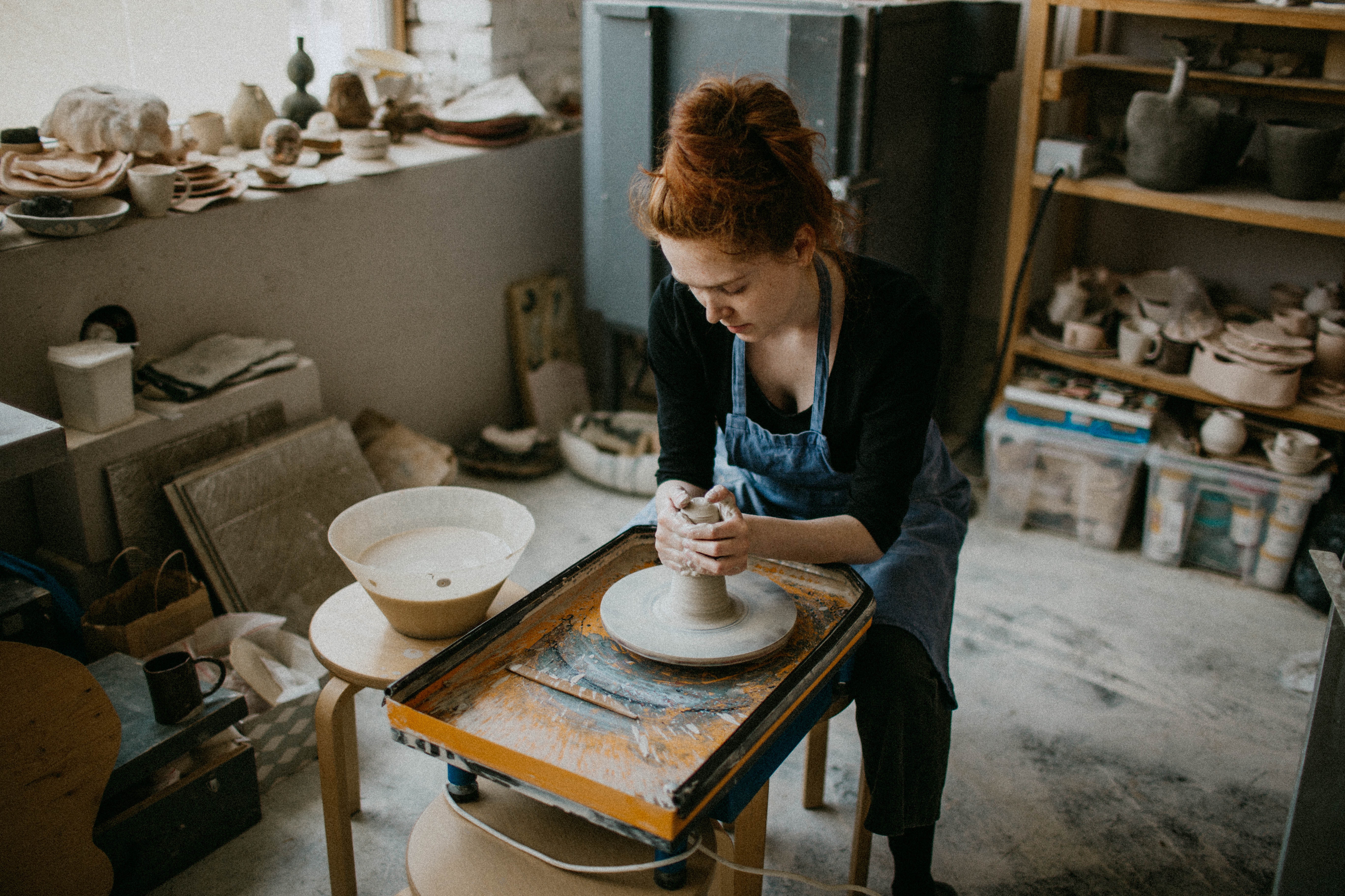
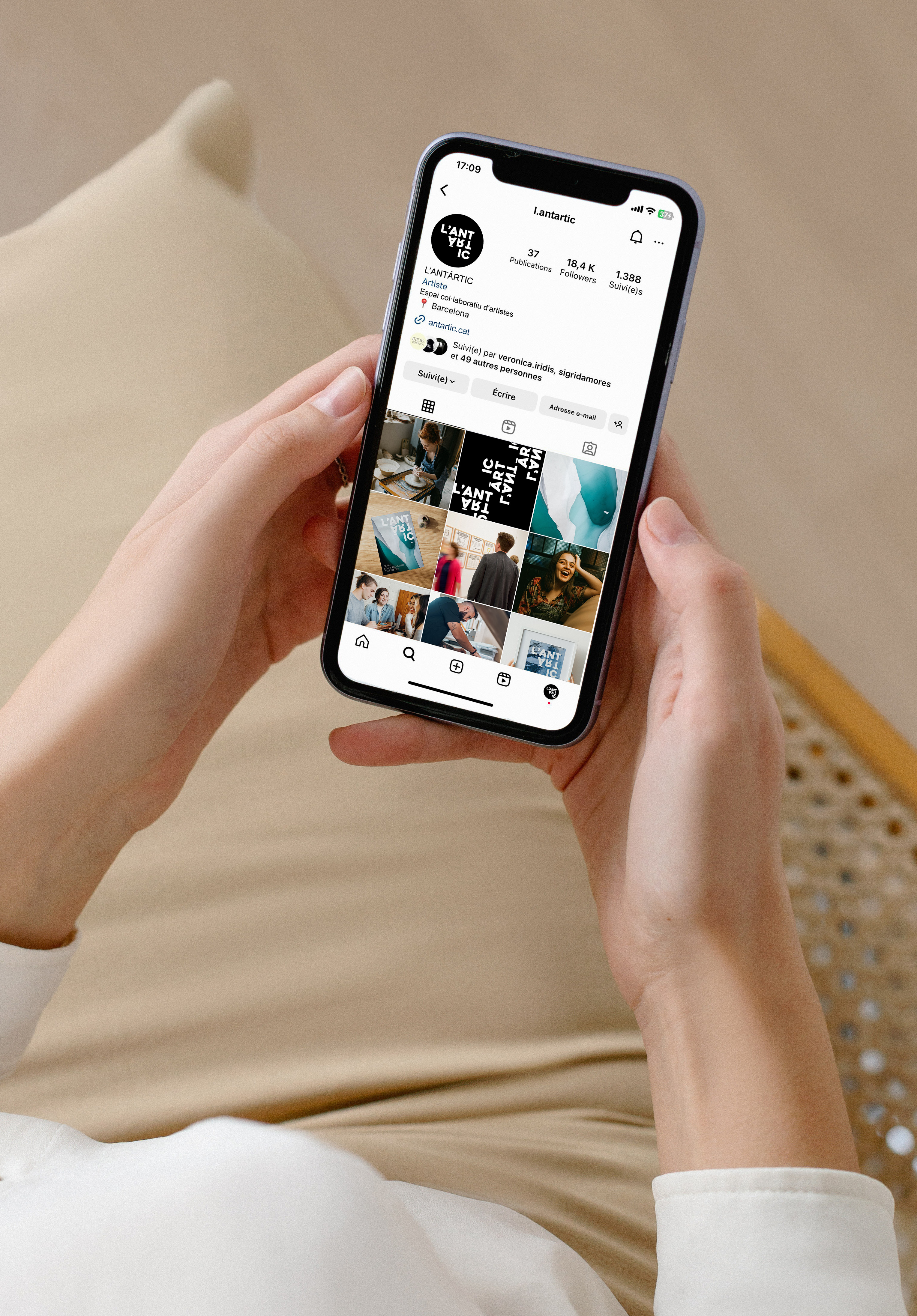
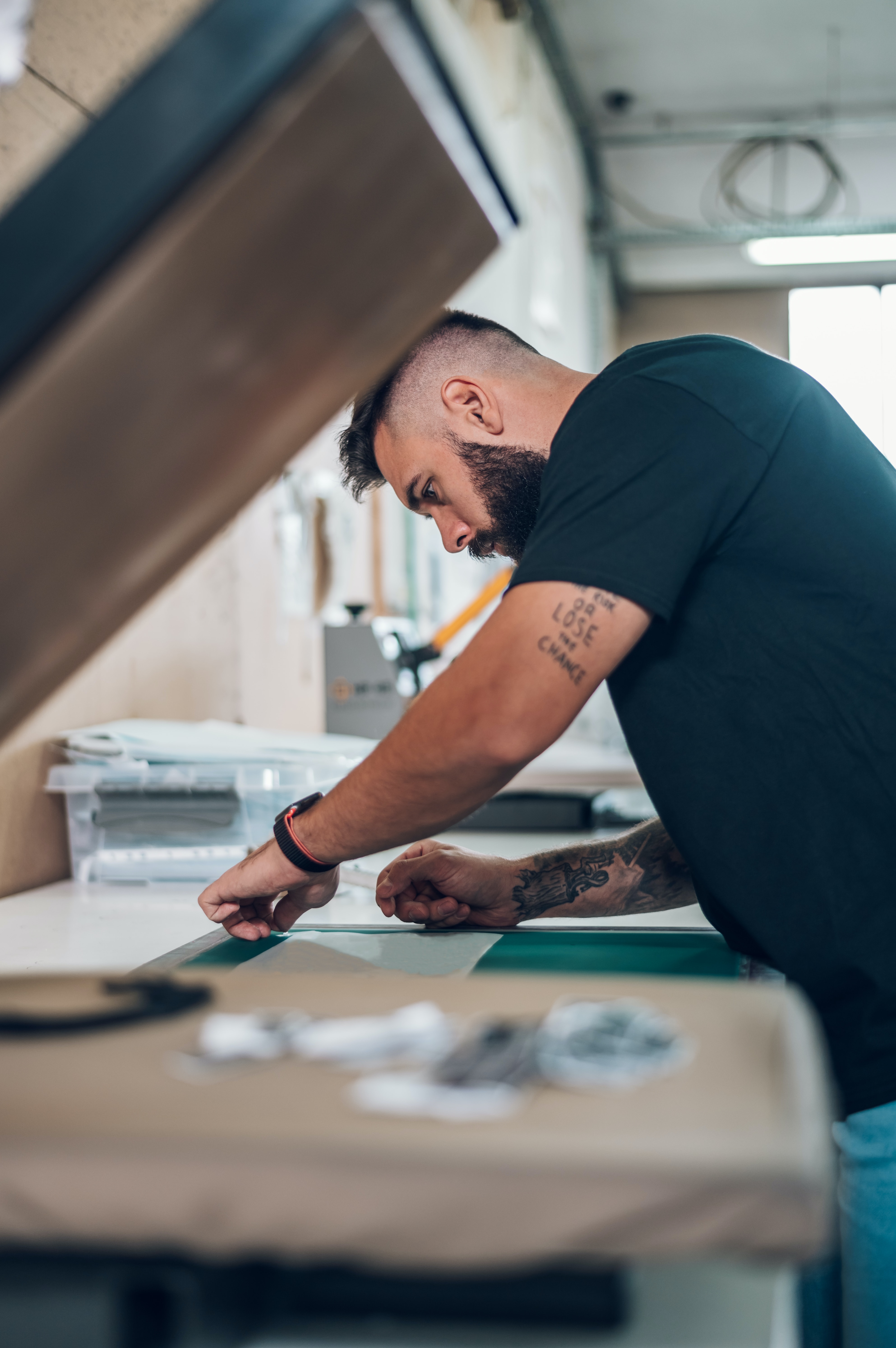
Through its coworking model, The Antarctic aims to create a vibrant community where artists can connect, collaborate, and support one another. It facilitates interactions, networking opportunities, and the sharing of knowledge and skills among its members.
In addition to the coworking aspect, The Antarctic continues to use art as a tool to address social, political, and environmental issues. It encourages critical reflection, promotes positive changes in society, and organizes artistic projects, exhibitions, workshops, talks, and other events to engage the community and stimulate dialogue.
In addition to the coworking aspect, The Antarctic continues to use art as a tool to address social, political, and environmental issues. It encourages critical reflection, promotes positive changes in society, and organizes artistic projects, exhibitions, workshops, talks, and other events to engage the community and stimulate dialogue.
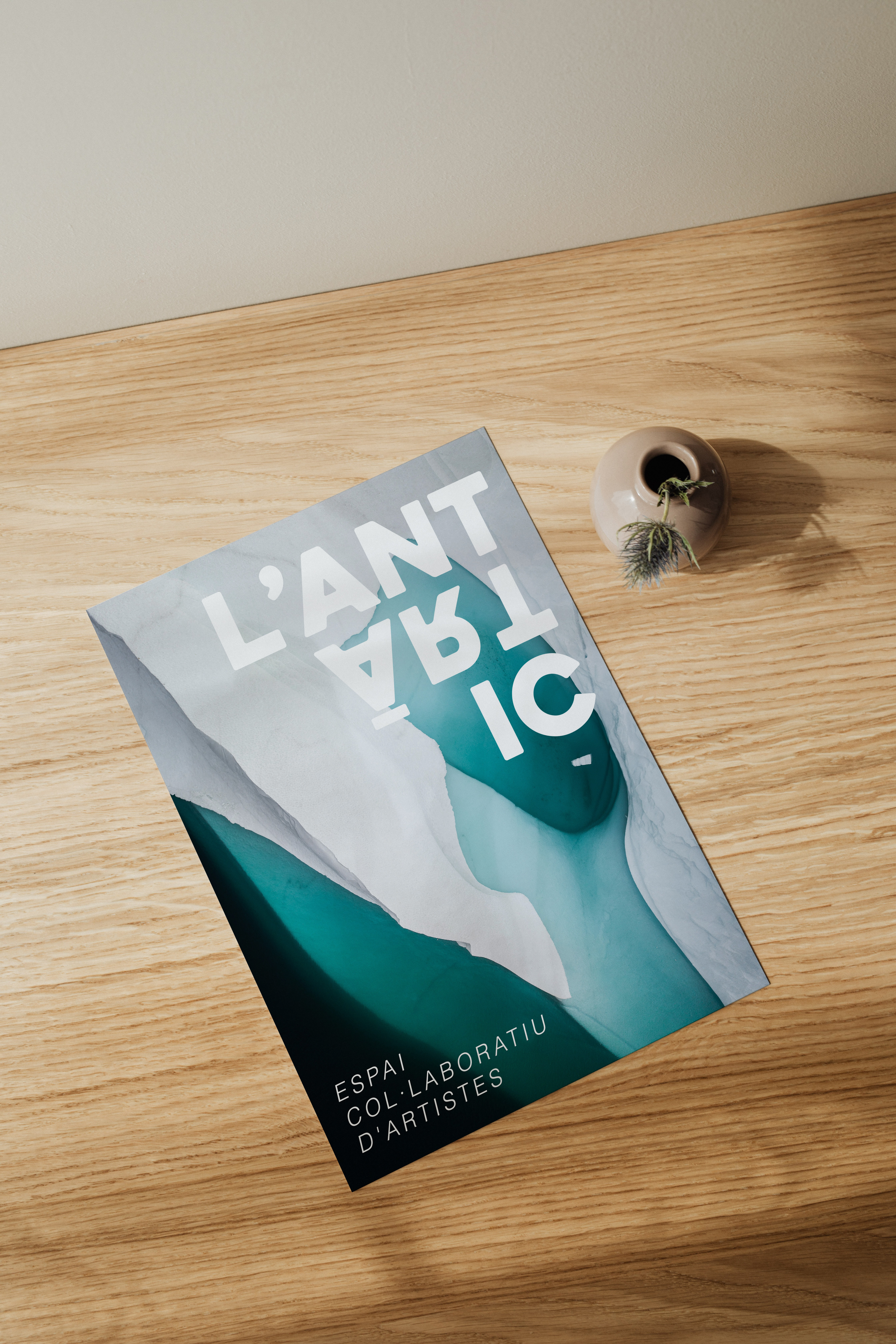
The logo "L'Antártic" is designed in a clear and memorable way.
The choice of the Heavitas typography gives the logo a strong and bold appearance, reflecting the confidence and professionalism associated with coworking.
The word "L'Antártic" is divided into three distinct parts that creates an upward-pointing arrow symbolizing the propulsion of individuals' careers in the coworking space, evoking progress, growth, and professional development.
An interesting visual element is the inversion of the word "art". This creates a unique visual effect and draws attention to the artistic and alternative aspect of coworking. The inversion suggests an innovative approach and the ability to see things from a different perspective.